Tidy chi-squared stats in infer
By Rich
February 3, 2018

MC Escher, “Ascending and Descending” 1960.
This blog post expands on the excellent talk delivered by Andrew Bray at rstudio::conf2018. The slides (PDF) from Andrew’s presentation can be found at this github link.
From the infer
homepage:
The objective of this package is to perform statistical inference using an expressive statistical grammar that coheres with the tidyverse design framework.
Let’s see how that’s done. First we install infer and load it into our environment.
# install.packages("infer")
library(infer)
library(cowplot) # for nice plots
infer is supposed to play well within the tidyverse, so we load that too, along with some data from the
General Social Survey.
library(tidyverse)
# loads some data from the general social survey
load(url("http://bit.ly/2E65g15"))
names(gss)
##  [1] "id"       "year"     "age"      "class"    "degree"   "sex"
##  [7] "marital"  "race"     "region"   "partyid"  "happy"    "relig"
## [13] "cappun"   "finalter" "natspac"  "natarms"  "conclerg" "confed"
## [19] "conpress" "conjudge" "consci"   "conlegis" "zodiac"   "oversamp"
## [25] "postlife" "party"    "space"    "NASA"
Question: Is funding for space exploration (NASA) a partisan issue?
Let’s start by looking at responses to the question: “Do you think funding for space exploration is too little, about right, or too much?”
gss %>% select(party, NASA)
## # A tibble: 149 × 2
##    party NASA
##    <fct> <fct>
##  1 Ind   TOO LITTLE
##  2 Ind   ABOUT RIGHT
##  3 Dem   ABOUT RIGHT
##  4 Ind   TOO LITTLE
##  5 Ind   TOO MUCH
##  6 Ind   TOO LITTLE
##  7 Ind   ABOUT RIGHT
##  8 Dem   ABOUT RIGHT
##  9 Dem   TOO LITTLE
## 10 Ind   TOO LITTLE
## # … with 139 more rows
We see that people can either select too little, about right, or too much. We can visualize this pretty easily:
gss %>%
  select(party, NASA) %>%
  ggplot(aes(x=party, fill = NASA)) +
  geom_bar()
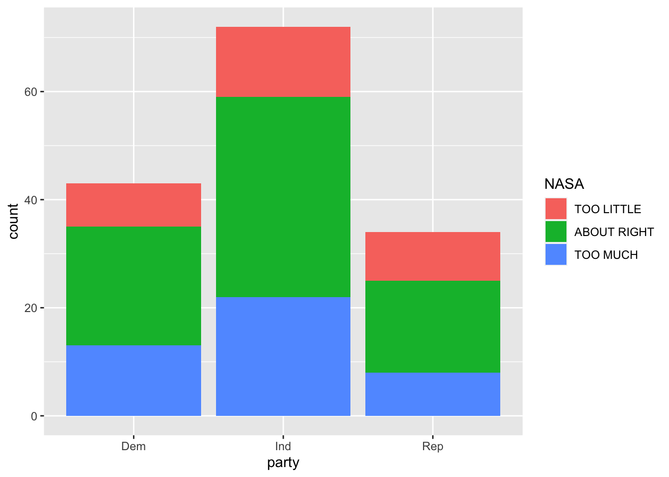
Count data can be misleading when we’re looking for trends between categorical variables within groups, so let’s normalize within-group-percentages with a position = "fill" argument in geom_bar().
gss %>%
  select(party, NASA) %>%
  ggplot(aes(x=party, fill = NASA)) +
  geom_bar(position = "fill") +
  ylab("within group percentage")
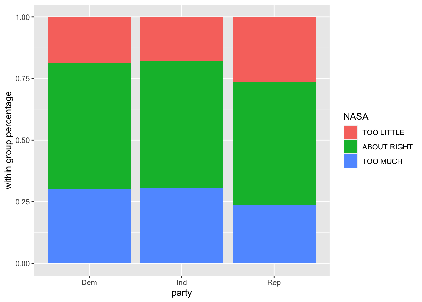
It doesn’t look like there’s much of a difference in how Democrats, Independents, and Republicans support space exploration, but let’s now drill down into this with some hypothesis testing, comparing base R and infer.
What we essentially have is a contingency table of party affiliation and attitude towards space exploration, and we want to see if there’s a relationship between these variables. The chi-squared test of independence is used to determine if a significant relationship exists between two categorical variables, so we will use this test.
- Null hypothesis: There is no realationship between party (Democrat, Independent, Republican) and attitude towards space exploration (too little, about right, too much).
- Alternative hypothesis: There is a relationship between party and attitude towards space exploration.
Before we perform a chi-squared test, in base R and infer, let’s quickly break down what a chi-squared test is all about.
We have our data (party and attitude towards space exploration), we assume:
- Assumption #1: Variable are categorical. There are 3 types of categorical data:
- Dichotomous: 2 groups (eg - Male and Female)
- Nominal: 3 or more categorical groups (eg - undergrad, professor, graduate student, postdoctoral scholar)
- Ordinal: ordered groups (eg - Pain Level 1, Pain Level 2, Pain Level 3, …)
- Assumption #2: Observations are independent of one another (eg - no relationship between any of the cases).
- Assumption #3: Categorical variable groupings must be mutually exclusive. In other words, we can’t have one participant as “Democrat” and “Independent”.
- Assumption #4: There must be at least 5 expected frequencies in each group of your categorical variable (only important for the analytical solution ).
We meet those assumptions, so let’s power ahead!
There are two main ways to solve this problem:
- Analytically (mathmematically)
- Programatically
Analytical Solution

We assume the expected values follow a Chi-squared distribution, with a probability density function that depends on the degrees of freedom. The plot above shows how the distribution varies with the degrees of freedom (k). On the x axis is the Chi-squared statistic, which we can calculate in R. We could then see where it falls in the distribution, and observe the probability of arriving at that combination of variables, or a more extreme example. As our Chi-squared test statistic increases, we move further along the x axis to the right. There is less area under the curve to the right, and our p-value (the area under the curve to the right of the observed statistic) decreases.
Generally speaking, a larger Chi-squared statistic suggests stronger evidence for rejecting our null hhypothesis. If we observe a p-value <= .05, we would reject our null hypothesis.
What would it mean to accept our alternative hypothesis?
In the case of our example, if we we lived in a completely random universe, less than 5% of the time we would arrive at the particular combination of party and attitude towards space exporlation we observe in our data. In other words, the relationship between party and attitude towards space exploration we see in our data is significant.
But is there actually a significant relationship between these variables? We will calculate a Chi-squared statistic for our data to find out.
Base R’s stats package has a function that takes two vectors of data, and returns a chi-squared test statistic, degrees of freedom, and p-value. Let’s save this observed chi statistic for later use.
chisq.test(gss$party, gss$NASA)
##
## 	Pearson's Chi-squared test
##
## data:  gss$party and gss$NASA
## X-squared = 1.3261, df = 4, p-value = 0.8569
observed_stat <- chisq.test(gss$party, gss$NASA)$stat
We might be tempted to look at this and say, “there’s a high p-value.” No significant relationship exists. Job done. This is what we expected looking at the bar plots earlier. But let’s go a step further with infer.
Programatic Solution
Another way to test if there is a significant relationship in our data is to take a programatic approach.
In his talk, Andrew Bray says:
If we live in world where variables are totally unrelated, the ties between variables are arbitrary, so they might just as well have been shuffled.
What would that random world look like? Let’s take one of the columns of our data_frame and scramble it.
gss %>% select(party, NASA) %>%
  mutate(permutation_1 = sample(NASA),
         permutation_2 = sample(NASA))
## # A tibble: 149 × 4
##    party NASA        permutation_1 permutation_2
##    <fct> <fct>       <fct>         <fct>
##  1 Ind   TOO LITTLE  ABOUT RIGHT   ABOUT RIGHT
##  2 Ind   ABOUT RIGHT TOO MUCH      ABOUT RIGHT
##  3 Dem   ABOUT RIGHT ABOUT RIGHT   ABOUT RIGHT
##  4 Ind   TOO LITTLE  TOO LITTLE    TOO LITTLE
##  5 Ind   TOO MUCH    TOO MUCH      ABOUT RIGHT
##  6 Ind   TOO LITTLE  ABOUT RIGHT   TOO LITTLE
##  7 Ind   ABOUT RIGHT ABOUT RIGHT   TOO MUCH
##  8 Dem   ABOUT RIGHT ABOUT RIGHT   TOO MUCH
##  9 Dem   TOO LITTLE  ABOUT RIGHT   TOO MUCH
## 10 Ind   TOO LITTLE  TOO MUCH      ABOUT RIGHT
## # … with 139 more rows
These premutations represent what we would expect to see if the relationship between variables was completeley random. We could generate many, many permuations, calcualte an Chi-squared statistic for each, and we would expect their distribution to approach the density functions shown above. Then we could plot our data on that distribution and see where it fell. If the area under the curve to the right of the point was less than 5%, we could reject the null hypothesis.
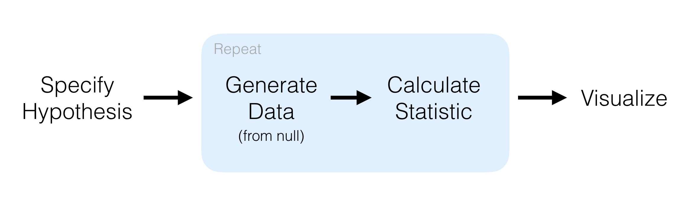
Infer makes this programatic approach very simple.

Main Verbs:
specify()is likedplyr::select(): choose the variables from your df to testhypothesize()is where we select the null hypothesisgenerate()creates permutated valuescalculate()lets you choose what test statistic to calculatevisualize()automatically plots permutated values with ggplot, making it easy to add geoms onto it
Highlights:
- dataframe in dataframe out
- compose tests with pipes
- reading an inferential chain describes an inferential procedure
gss %>%
  specify(NASA ~ party)  %>%
  hypothesize(null = "independence") %>%
  generate(reps = 1000, type = "permute") %>%
  calculate(stat = "Chisq") %>%
  visualize() +
  # add a vertical line for gss data
  geom_vline(aes(xintercept = observed_stat), color = "red")
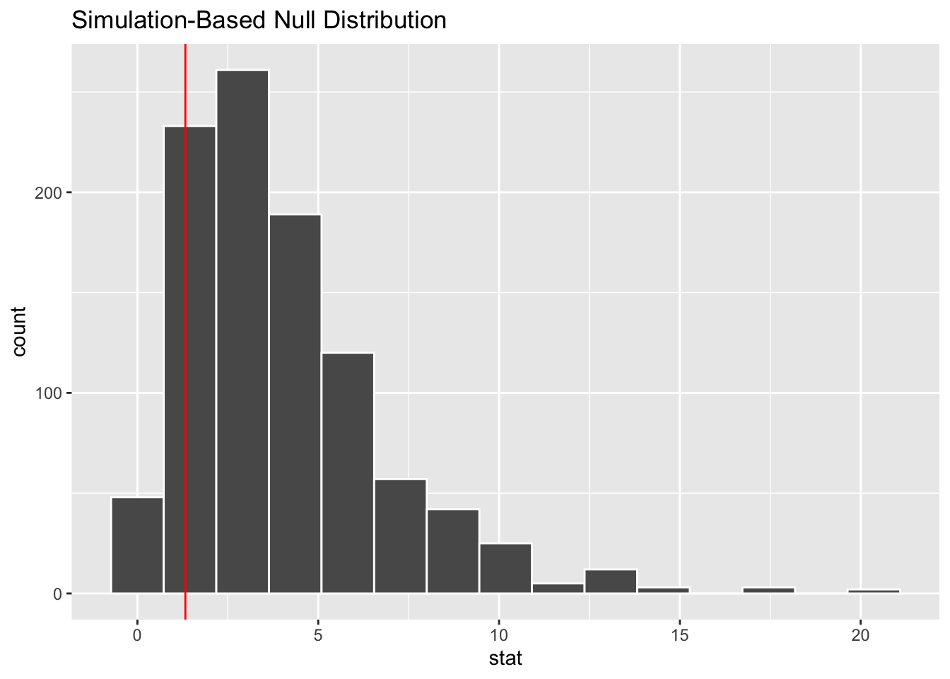
If we wanted to get a p-value from this programatic appraoch, we can calculate the area under the curve to the right of the observed statistic.
gss %>%
  specify(NASA ~ party)  %>%
  hypothesize(null = "independence") %>%
  generate(reps = 1000, type = "permute") %>%
  calculate(stat = "Chisq") %>%
  summarise(p_val = mean(stat > observed_stat))
## # A tibble: 1 × 1
##   p_val
##   <dbl>
## 1 0.862
If we omit visualize, we get a dataframe of the permuted values:
gss %>%
  specify(NASA ~ party)  %>%
  hypothesize(null = "independence") %>%
  generate(reps = 1000, type = "permute") %>%
  calculate(stat = "Chisq") #%>%
## Response: NASA (factor)
## Explanatory: party (factor)
## Null Hypothesis: independence
## # A tibble: 1,000 × 2
##    replicate  stat
##        <int> <dbl>
##  1         1 3.98
##  2         2 2.00
##  3         3 0.712
##  4         4 2.14
##  5         5 4.41
##  6         6 1.38
##  7         7 4.61
##  8         8 1.82
##  9         9 4.89
## 10        10 1.47
## # … with 990 more rows
  # visualize() +
  # geom_vline(aes(xintercept = observed_stat), color = "red") # add a vertical line for gss data
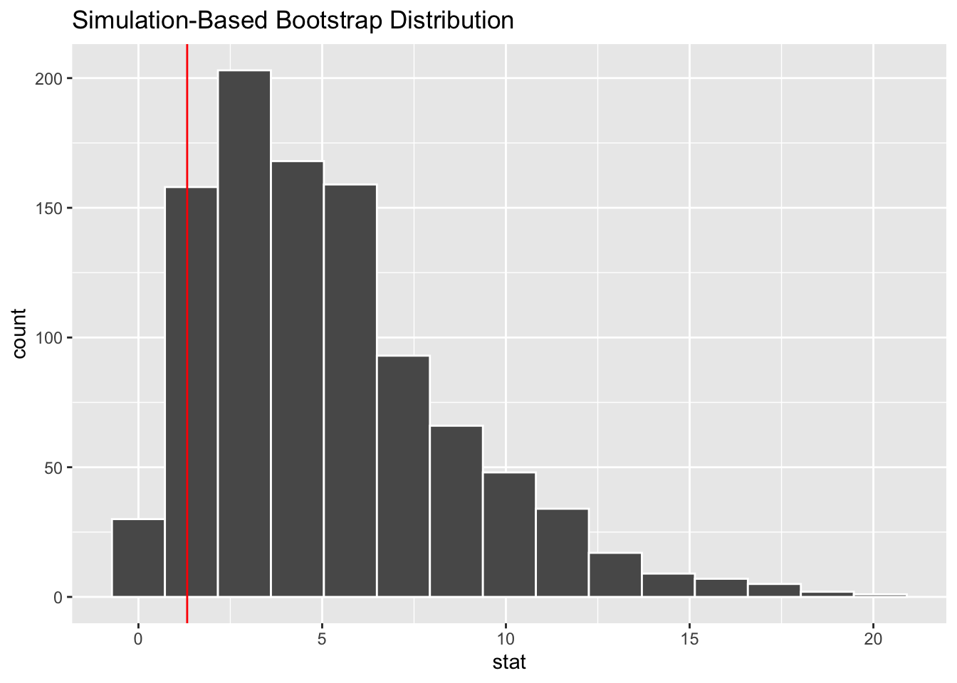
If we omit hypothesize, we can bootstrap samples from our data.
gss %>%
  specify(NASA ~ party)  %>%
  #hypothesize(null = "independence") %>%
  generate(reps = 1000, type = "bootstrap") %>%
  calculate(stat = "Chisq") %>%
  visualize() +
  geom_vline(aes(xintercept = observed_stat), color = "red")
Reusable Parts
One of the key features of infer is that the functions are reusable. To illustrate, let’s consider the differences between men and women in their reported level of happiness in our dataset. We could observe this with a simple bar plot.
This is sample from a population, and there’s going to be some uncertainty associated with that sample. We can bound the uncertainty by adding confidence intervals, and accomplish this with reusable infer verbs.
gss %>% select(sex, happy) %>%
  ggplot() +
  geom_bar(aes(x = sex, fill = happy), position = "fill")
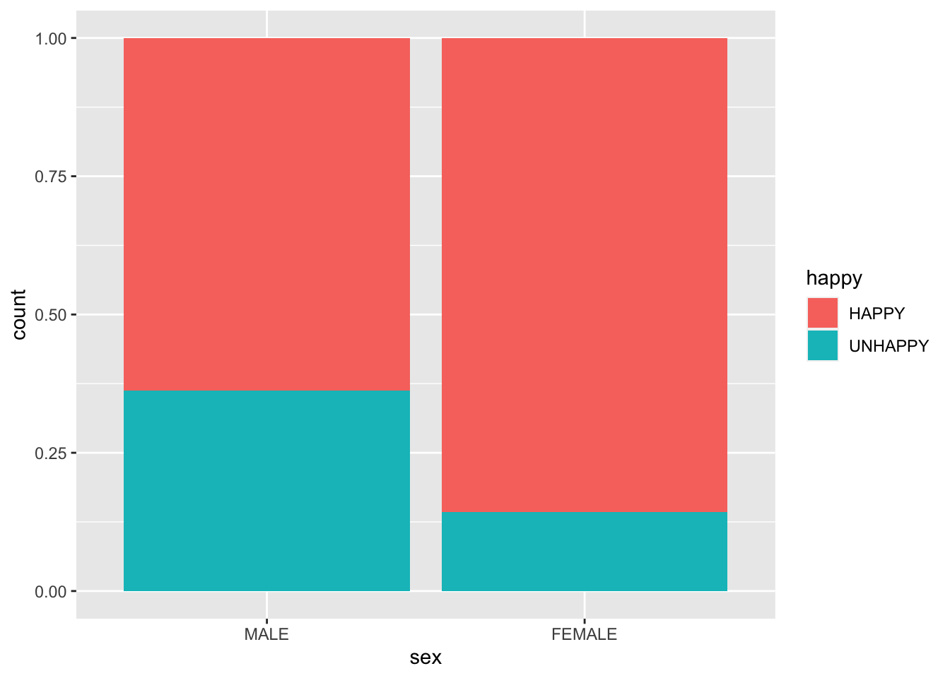
We could go on to measure the difference between male and female happiness by looking at the difference in the proportion of respondents claiming to be “Happy” or “Unhappy”. Let’s save these proportions for later.
gss %>% select(sex, happy) %>%
  group_by(sex, happy) %>%
  summarise(n = n()) %>%
  mutate(prop = n / sum(n))
## `summarise()` has grouped output by 'sex'. You can override using the `.groups`
## argument.

## # A tibble: 4 × 4
## # Groups:   sex [2]
##   sex    happy       n  prop
##   <fct>  <fct>   <int> <dbl>
## 1 MALE   HAPPY      37 0.638
## 2 MALE   UNHAPPY    21 0.362
## 3 FEMALE HAPPY      78 0.857
## 4 FEMALE UNHAPPY    13 0.143
This table suggest that females in our sample population are on average, 12% happier than males. We can visualize that difference in a plot.
obs_stat <- gss %>% # p_female - p_male
  group_by(sex) %>%
  summarize(p = mean(happy == "HAPPY")) %>%
  summarize(diff(p)) %>%
  pull()

x_pos <- "diff in happiness"

p <- data_frame(diff = obs_stat) %>%
  mutate(x = x_pos) %>%
  ggplot() +
  geom_point(aes(x = x, y = diff), stat="identity", size = 4)
## Warning: `data_frame()` was deprecated in tibble 1.1.0.
## Please use `tibble()` instead.
## This warning is displayed once every 8 hours.
## Call `lifecycle::last_lifecycle_warnings()` to see where this warning was generated.
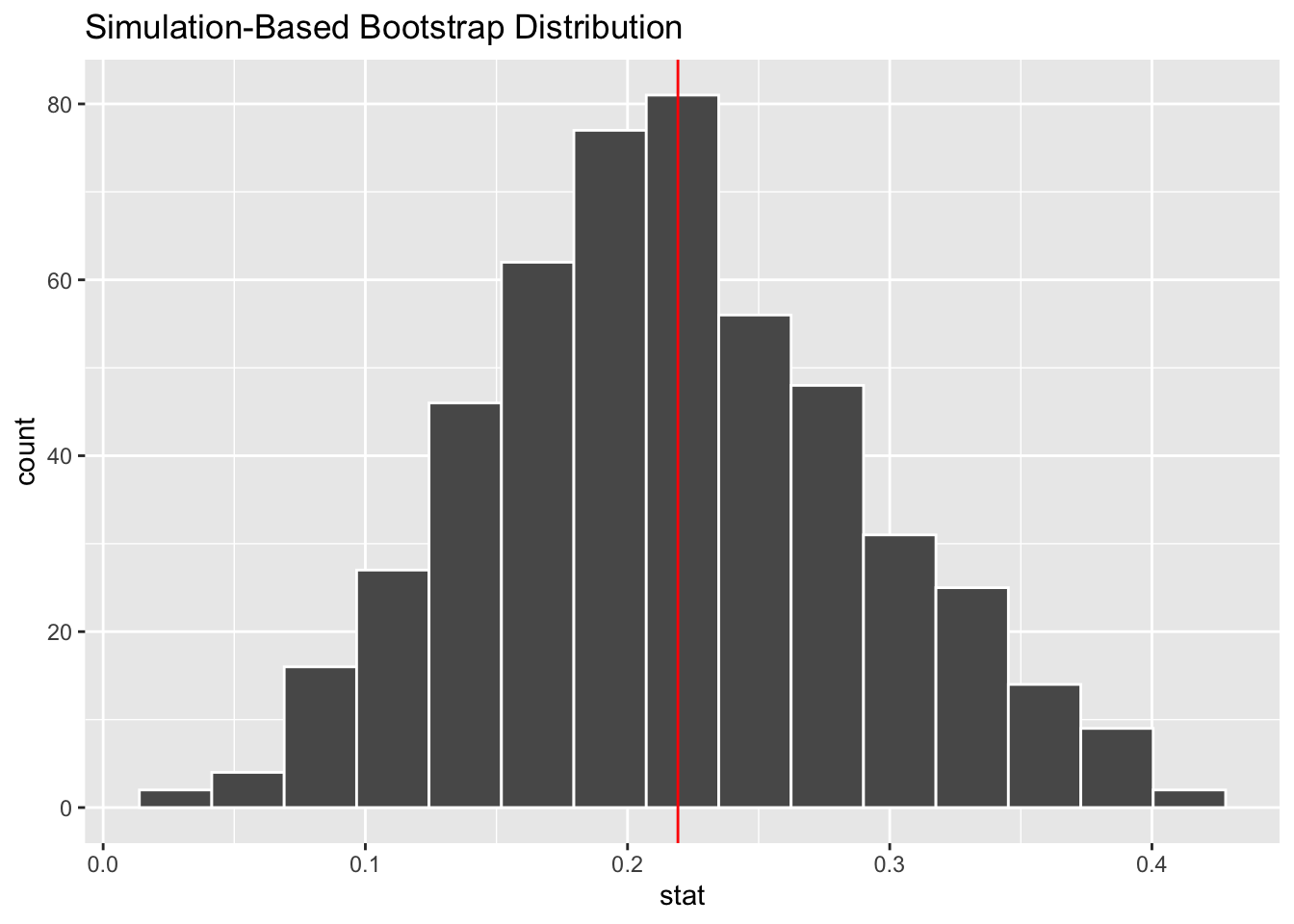
We’re not quite done. infer helps us assess our uncertainty in this statistic by calculating a confidence interval, which adds two standard errors to the point estimate.
The standard error is the variablility we would expect in our data if we drew many new samples from the population (eg - more surveys). Assuming normality in our population, we can estimate that variability by bootstraping. The result will be centered on our statistic, rather than a null value.
boot <- gss %>%
  specify(happy ~ sex, success = "HAPPY") %>%
  generate(reps = 500, type = "bootstrap") %>%
  calculate(stat = "diff in props", order = c("FEMALE", "MALE"))

visualize(boot) +
  geom_vline(aes(xintercept = obs_stat), color = "red")
We can easily calculate the standard error (SD) of the distribution of bootstrapped samples, and then formulate confidence intervals.
95.45% of a normal population lies between two standard deviations below and above the mean. If we take the more memorbale ‘2’ standard errors (compared to the less memorable ‘1.96’) above and below our sample statistic, we enclose 95% of the population.
SE <- boot %>%
  summarize(sd(stat)) %>%
  pull()

SE
## [1] 0.0732147
CI <- c(obs_stat - 2 * SE, obs_stat + 2 * SE)

CI
## [1] 0.07278243 0.36564122
And now we can add these confidence intervals to our etimate of the measured difference in happiness between men and women in our population with geom_segment.
x_pos <- "diff in happiness"

data_frame(diff = obs_stat) %>%
  mutate(x = x_pos) %>%
  ggplot() +
  geom_point(aes(x = x, y = diff), stat="identity", size = 4) +
  geom_segment(aes(x = x_pos, xend = x_pos, y = CI[1], yend = CI[2]))
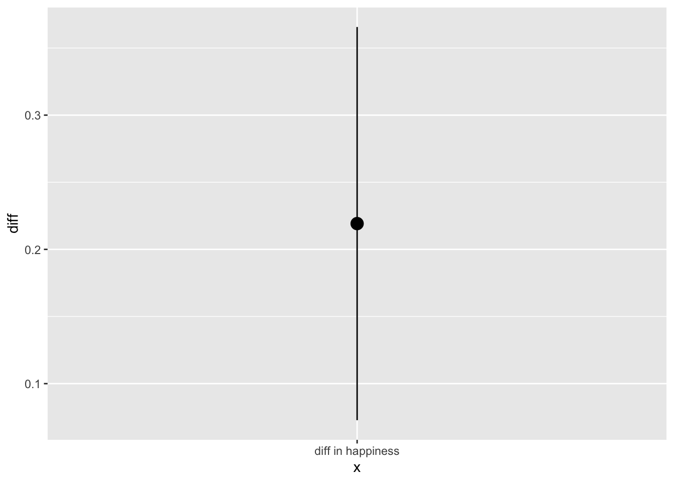
Et voila. Confidence intervals made easy via bootstrapping in infer.
Conclusion
Two things stand out to me about infer. One is that it makes me think through the steps of what I’m doing, and the verbs in infer are reusable. Two, I save time because everything happens in a tidy way that plays well with dplyr. This makes it easy to hypothesis test, mutate and summarise new variables, pipe results into a ggplot. The workflow and results are readable and memorable.
I look forward to seeing what’s down the line from infer. It seems like a powerful and concise way to perform statistical inference and hypothesis test. I’m very grateful to Andrew Bray for the excellent talk, and the developers of infer for their hard work on tidy and expressive statistical inference.
- Posted on:
- February 3, 2018
- Length:
- 11 minute read, 2277 words
- See Also: